EVENT MANAGEMENT, SIMPLIFIED
BRAND GUIDELINES
Visual Identity System — Logo, Color & Social Media Usage
NaliGrid is an event management platform built for Nigerian event planners and coordinators — covering pipeline tracking, vendor management, and guest RSVPs in one place. It replaces the spreadsheets, WhatsApp threads and paper notes planners currently juggle with one reliable system.
The brand mark is built from two interlocking letterforms — a linked D and G — forming a continuous chain. It's a visual metaphor for what the product does: connecting every moving part of an event — planner, vendor, guest — into one unbroken chain that doesn't drop a link.
Plan. Execute. Celebrate.
Three words, three phases of every event a planner runs. Always used together, always in that order, wherever the full lockup appears.
| Trait | What it looks like in practice |
|---|---|
| Premium | Gold and black signal quality in the Nigerian market — never cluttered, never cheap-looking. |
| Reliable | Clean structure, dense information organised — never chaotic, even under pressure. |
| Fast | Built to be scanned in seconds, on a phone, at a venue, at night. |
| Nigerian-first | Designed around how Nigerian planners actually work — not a generic global template. |
The primary logo is a horizontal lockup: the interlocking D+G icon, followed by the wordmark "NaliGrid" and the tagline "Plan. Execute. Celebrate." Always treat the icon and wordmark as one unit — do not separate, rearrange, or resize them independently within the lockup.
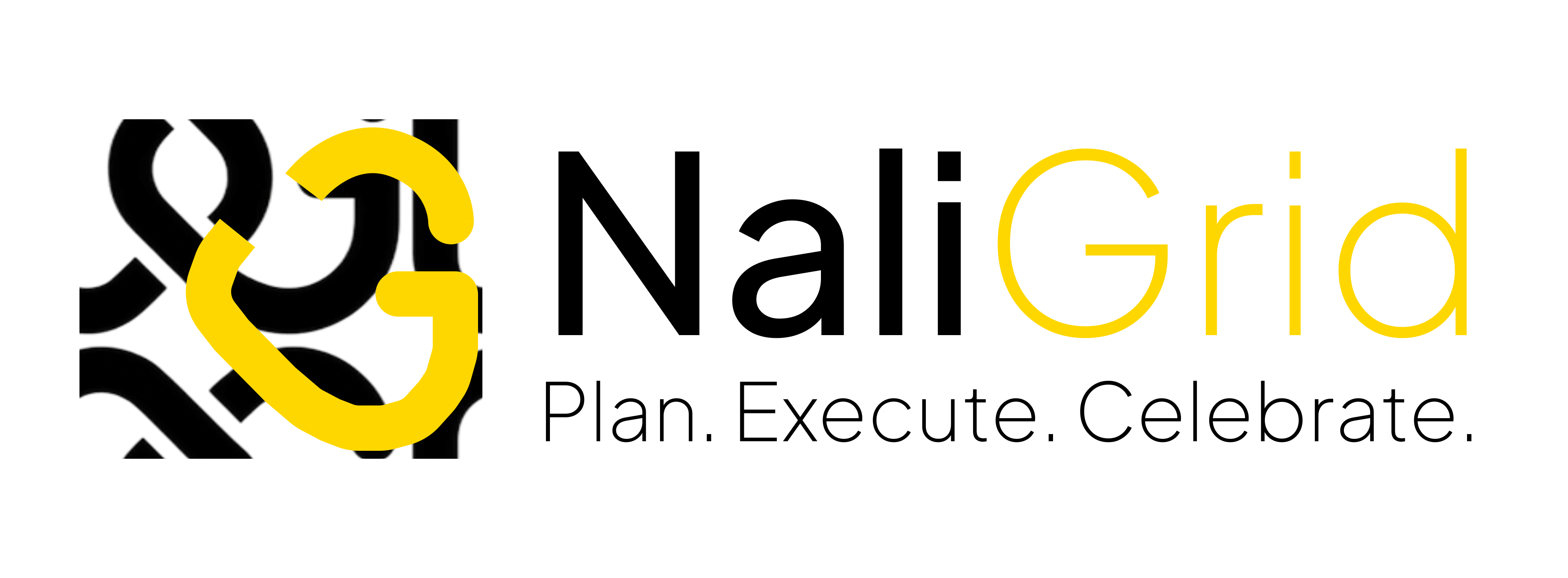
Keep a minimum clear space equal to the height of the "G" icon shape around all sides of the logo — no text, imagery, or other elements should enter this zone.
Minimum clear space = height of the icon mark, on all four sides
The transparent icon mark can be used on its own for small spaces — app icons, social profile pictures, favicons — provided it is placed on a sufficiently dark background so the white details stay clear and readable.
| Use case | Minimum width |
|---|---|
| Full lockup — print | 35mm / 1.4in |
| Full lockup — digital/screen | 140px |
| Icon mark alone — digital/screen | 32px (favicon: 16px minimum, simplified) |
Below these sizes the interlocking detail of the "D" and "G" starts to lose definition, especially on lower-quality screens or print stock.
The mark only works if it stays consistent everywhere it appears. These are the most common ways it gets damaged — avoid all of them.
Also avoid: placing the logo over busy or low-contrast photography, using the icon mark and wordmark as separate unrelated elements, and recreating the wordmark in a different typeface.
NaliGrid uses two related but distinct gold values — one for the brand mark and marketing, one for the product UI. Using the wrong one in the wrong place is the single most common inconsistency to watch for.
Use these for the logo, social media, marketing collateral, and any external-facing brand materials.
Used inside the NaliGrid app. The UI accent gold is deliberately more muted than the logo gold — easier on the eyes across long screen sessions on a dark interface.
Reserved for in-app status meaning — never used decoratively. Red is reserved strictly for errors, blocked states, or critical issues.
Plus Jakarta Sans is used everywhere — product, marketing, and social media. It's a free Google Font, so it's easy for any designer on the team to install and match exactly.
Light 300 · Regular 400 · Medium 500 · Semibold 600 · Bold 700
Social content should feel unmistakably NaliGrid at a glance — dark background, gold accent, clean and premium. Avoid busy stock photography or generic light-mode templates.
| Element | Rule |
|---|---|
| Background | Default to dark (#111827) or pure black; avoid pure white backgrounds for feed posts |
| Accent | Use Logo Gold (#FDCF00) for accents, rules, and highlight text — sparingly, as a highlight not a fill |
| Logo placement | Icon mark alone in a corner for post templates; full lockup only on title/cover slides |
| Safe zone | Keep logo and key text at least 5% inset from every edge to survive platform cropping |
| Typography | Plus Jakarta Sans, Regular 400 for titles & headlines, Regular for supporting copy |
| Imagery | Real Nigerian event photography (weddings, corporate events) over generic stock; warm, premium lighting |
| Tone of voice | Confident, clear, practical — speaks to planners as professionals, not hobbyists |
Use this table to pick the right file for the job. When in doubt, the SVG is the master file — scale it to whatever's needed rather than stretching a PNG.
| File | Contents | Best used for |
|---|---|---|
| ng-logo-wg.svg / png | Full lockup, white & gold, transparent background | Dark backgrounds — presentations, dark social posts, video |
| ng-logo-bg.svg / png | Full lockup, black & gold, transparent background | Light backgrounds — print, documents, light social posts |
| favicon-32x32-transparent.png | Icon mark only, white & gold, transparent background | Profile pictures, favicons, app icons, small placements |
The current set covers PNG and SVG formats. For ongoing design work, it's worth also maintaining:
| Format | Why |
|---|---|
| Vector EPS / AI source file | For print vendors and large-format signage (banners, roll-ups for the Abuja/Lagos/PH webinars) |
| Favicon set (16/32/48px ICO + PNG) | Browser tab icon for naligrid.com — icon mark simplified for tiny sizes |
| Social profile kit | Pre-cropped square (profile) and 1500×500 (cover) versions per platform |
| Monochrome / single-color version | For contexts where two-color reproduction isn't possible (some print, embroidery, stamps) |